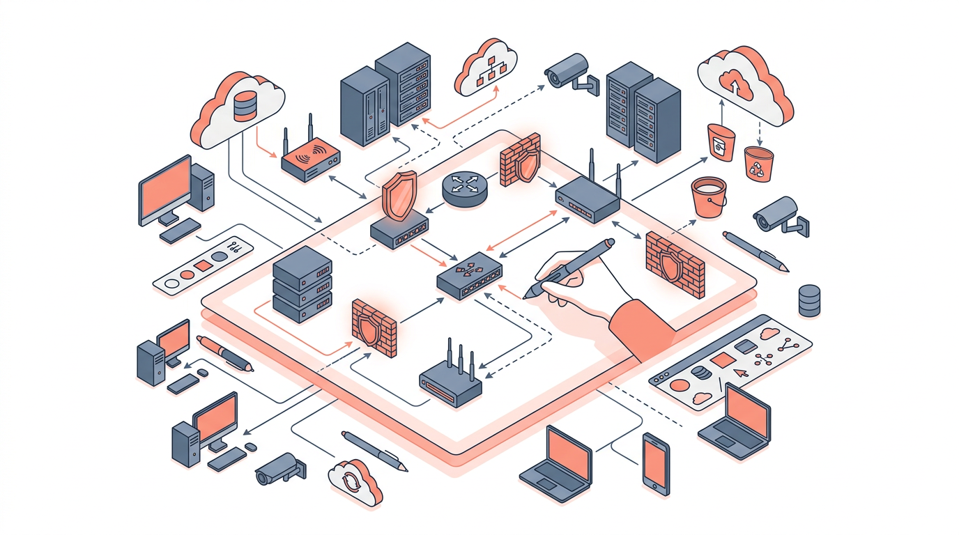
Drawing a network diagram means creating a visual map of how devices, services, and connections relate to each other in a system. Whether you're documenting a home lab, designing a production AWS environment, or troubleshooting a connectivity issue, a clear network diagram is often the fastest way to communicate what's happening. This guide walks you through every step — from choosing the right diagram type to placing your first node — with concrete examples and practical advice for 2026 tooling.
By the end of this article you'll understand the standard symbols used in network diagrams, the difference between logical and physical diagrams, how to lay out a diagram that others can actually read, and which tools (manual and AI-assisted) are worth your time.
What Is a Network Diagram and Why Does It Matter?
A network diagram is a structured visual representation of nodes (devices, services, or endpoints) and the edges (connections, protocols, or data flows) between them. It matters because verbal descriptions of network topology are ambiguous; a diagram removes that ambiguity in seconds.
Network diagrams serve several concrete purposes:
- Incident response — engineers can trace a failing path without memorizing every hop.
- Change management — reviewers can spot blast-radius risks before a change window.
- Compliance documentation — auditors (SOC 2, PCI-DSS, ISO 27001) require topology evidence.
- Onboarding — new team members understand the environment in minutes, not weeks.
Even a rough, hand-drawn sketch on a whiteboard counts. Accuracy and clarity matter more than polish.
Logical vs. Physical Network Diagrams
Logical diagrams show how data flows; physical diagrams show where hardware lives. You almost always need both, but they answer different questions.
| Dimension | Logical Diagram | Physical Diagram |
|---|---|---|
| Primary focus | IP addressing, routing, VLANs, protocols | Cables, rack positions, hardware models |
| Audience | Network architects, developers, security | Data-center ops, field engineers |
| Changes frequently? | Yes — with every topology change | Less often — hardware moves are rare |
| Cloud relevance | High — maps VPCs, subnets, peering | Low — cloud abstracts physical layer |
| Example elements | Route tables, security groups, load balancers | Patch panels, switch ports, fiber runs |
For most cloud-native teams in 2026, logical diagrams are the daily workhorse. Physical diagrams matter most when you manage on-premises or hybrid infrastructure.
Standard Symbols and Notation
Using consistent symbols is what separates a readable diagram from a confusing one. The two dominant standards are Cisco's icon library and AWS's official architecture icons (updated in 2023 and still current). For generic network diagrams, a small set of shapes covers the majority of use cases.
| Symbol | Represents | Common Shape |
|---|---|---|
| Router | Layer-3 routing between networks | Circle with arrows |
| Switch | Layer-2 switching within a network | Rectangle with arrows |
| Firewall | Traffic filtering / security boundary | Brick-wall rectangle |
| Server / EC2 | Compute endpoint | Rectangle or AWS icon |
| Cloud / Internet | External network | Cloud outline |
| Load Balancer | Traffic distribution | Triangle or AWS ELB icon |
| Database | Persistent storage | Cylinder |
| VPN Gateway | Encrypted tunnel endpoint | Lock + cylinder |
Tip: Pick one icon set and stick to it within a single diagram. Mixing Cisco icons with AWS icons in the same diagram creates visual noise and confuses readers.
Step-by-Step: How to Draw a Network Diagram
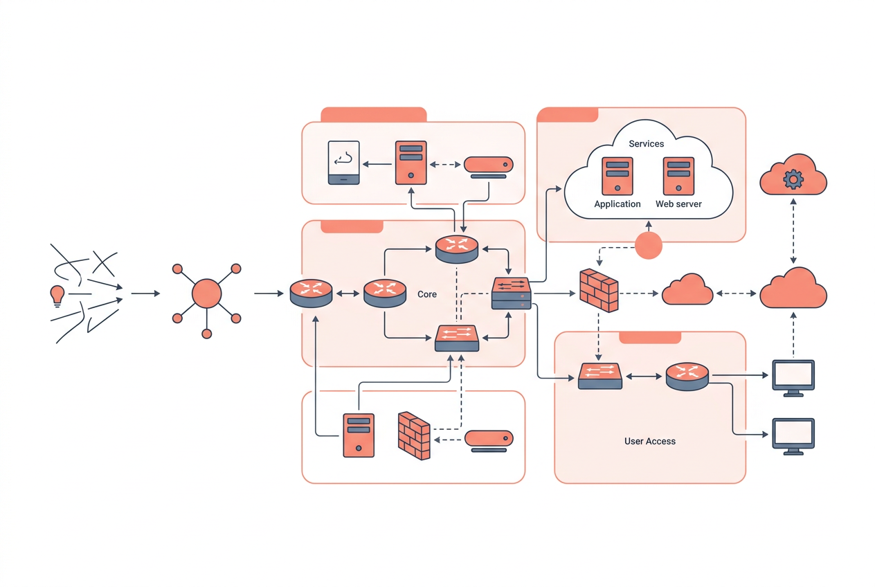
Step 1 — Define the Scope and Audience
Before placing a single shape, answer two questions: What decision or question does this diagram need to answer? and Who will read it?
A diagram for a security review needs explicit subnet CIDR blocks, security group rules, and trust boundaries. A diagram for an executive briefing needs none of that — it needs service names and data flow arrows. Scope creep is the single biggest reason network diagrams become unreadable.
Step 2 — Inventory Your Components
List every node that belongs inside your scope. For an AWS environment this typically means:
- VPCs and their CIDR ranges (e.g.,
10.0.0.0/16) - Subnets (public, private, isolated) with their CIDR blocks
- EC2 instances, ECS clusters, or Lambda functions
- Managed services: RDS, ElastiCache, S3, DynamoDB
- Networking constructs: Internet Gateway, NAT Gateway, Transit Gateway, VPN Gateway
- Security boundaries: Security Groups, Network ACLs, AWS WAF, Shield
Write this list down before you open any diagramming tool. Discovering a missing component mid-layout forces expensive rearrangement.
Step 3 — Choose a Layout Strategy
Hierarchical (top-to-bottom) is the most readable layout for most network diagrams. Place the internet or external boundary at the top, work downward through tiers: edge → DMZ → application → data.
Alternative layouts:
- Left-to-right — good for pipeline or data-flow diagrams where sequence matters.
- Concentric rings — useful for zero-trust diagrams where trust level is the organizing principle.
- Free-form — avoid unless the diagram is exploratory; it's hard to maintain.
Step 4 — Draw Boundaries First, Then Nodes
Start with boundary boxes (VPCs, Availability Zones, on-premises networks, trust zones) before placing individual nodes. Boundaries give your diagram a skeleton. Nodes placed inside boundaries immediately communicate containment relationships without requiring labels.
In AWS diagrams, the canonical nesting order is:
Region
  └── VPC
        └── Availability Zone
              └── Subnet (public / private)
                    └── Service (EC2, RDS, Lambda…)
Step 5 — Add Nodes and Label Them Consistently
Place nodes inside their correct boundary. Use a consistent labeling convention — for example:
- Service type + environment + index:
ec2-prod-web-01,rds-prod-mysql-01 - Include the port and protocol on connection lines where relevant:
TCP 443,TCP 5432,UDP 53
Avoid generic labels like "Server 1." Six months later, nobody — including you — will remember what it means.
Step 6 — Draw Connections with Direction and Protocol
Connections should be directed arrows, not plain lines, whenever data flow has a meaningful direction. Label each arrow with the protocol and port. For bidirectional flows, use a double-headed arrow but still label the protocol.
Common connections to document explicitly:
- Client → ALB:
HTTPS TCP 443 - ALB → EC2:
HTTP TCP 80(internal, TLS-terminated at ALB) - EC2 → RDS:
MySQL TCP 3306 - EC2 → S3:
HTTPS TCP 443(via VPC Endpoint or NAT) - On-premises → VPC:
IPSec UDP 500 / 4500
Step 7 — Add a Legend and Metadata
Every diagram shared beyond your immediate team needs a legend explaining any non-standard symbols, color coding, or line styles. Add a metadata block in a corner:
- Author and last-updated date
- Environment (prod / staging / dev)
- Diagram version
This seems bureaucratic until the first time someone acts on a stale diagram during an incident.
Choosing the Right Tool
| Tool | Best For | Cloud-Native Support | AI Generation | Free Tier |
|---|---|---|---|---|
| draw.io (diagrams.net) | General-purpose, offline | AWS/Azure icon packs | No | Yes |
| Lucidchart | Team collaboration | AWS/GCP/Azure shapes | Limited | Limited |
| draft1.ai | AWS architecture from prompts | Native AWS | Yes | Yes |
| Cloudcraft | AWS cost + topology | Deep AWS integration | No | Limited |
| Excalidraw | Quick sketches, whiteboarding | None | No | Yes |
| Mermaid / PlantUML | Diagrams-as-code in Git | Limited | No | Yes |
Diagrams-as-code (Mermaid, PlantUML, or Terraform-derived tools) are increasingly popular in 2026 because they live in version control alongside infrastructure code. AI-assisted tools like draft1.ai let you describe an architecture in plain English and receive a structured diagram instantly — useful for first drafts and documentation sprints.
Common Mistakes to Avoid
- Overcrowding — if a diagram has more than ~30 nodes, split it into multiple diagrams at logical boundaries (e.g., one per VPC or per service domain).
- Missing security boundaries — omitting firewalls, security groups, or NACLs makes a diagram useless for security reviews.
- Unlabeled connections — a line between two nodes with no protocol or port label forces the reader to guess.
- Stale diagrams — a diagram that doesn't match reality is worse than no diagram; it actively misleads. Treat diagrams as living documents.
- Ignoring the audience — a diagram that tries to serve both executives and engineers usually serves neither.
Key Takeaways
- A network diagram is a visual map of nodes and connections; clarity and accuracy matter more than visual polish.
- Always define scope and audience before opening a diagramming tool.
- Draw boundary boxes first, then place nodes inside them — this communicates containment without extra labels.
- Label every connection with its protocol and port (e.g.,
TCP 443,TCP 3306). - Logical diagrams (IP, routing, services) and physical diagrams (hardware, cables) serve different audiences and should be kept separate.
- Use a consistent icon set — either Cisco standard or AWS official icons — within a single diagram.
- Treat diagrams as living documents: version them, date them, and update them when infrastructure changes.
Frequently Asked Questions
What is the difference between a network diagram and a topology diagram?
They are largely synonymous in everyday usage. Strictly speaking, a topology diagram emphasizes the structural pattern of connections (star, mesh, ring), while a network diagram is broader and includes IP addressing, protocols, and service details. In practice, most engineers use the terms interchangeably.
How detailed should a network diagram be?
The right level of detail depends entirely on the diagram's purpose. For incident response, include IP addresses, ports, and security boundaries. For a high-level architecture review, service names and data-flow directions are sufficient. A good rule of thumb: include every detail a reader needs to answer the question the diagram is meant to answer — and nothing more.
Do I need special software to draw a network diagram?
No. A whiteboard sketch or a diagram drawn in Google Slides is perfectly valid for many purposes. Dedicated tools like draw.io, Lucidchart, or draft1.ai add value through standard icon libraries, collaboration features, and export options — but the underlying skill is understanding what to draw, not which tool to use.
What AWS services are most commonly shown in network diagrams?
The most frequently diagrammed AWS services are VPC, EC2, Application Load Balancer (ALB), RDS, S3, Internet Gateway, NAT Gateway, Transit Gateway, Route 53, and CloudFront. Security constructs — Security Groups, Network ACLs, and AWS WAF — should appear on any diagram used for security review.
How do I keep network diagrams up to date?
The most reliable approach is to treat diagrams as code: store them in the same Git repository as your infrastructure-as-code (Terraform, CloudFormation), review them in pull requests, and update them as part of every infrastructure change. AI-assisted tools that generate diagrams from live cloud configurations (via API) can also reduce the maintenance burden significantly.
Can I auto-generate a network diagram from my AWS account?
Yes. Several tools can introspect your AWS environment and produce a diagram automatically. AWS Config combined with third-party tools, Cloudcraft, and draft1.ai all support some form of auto-discovery or prompt-to-diagram generation. Auto-generated diagrams are excellent starting points but typically need manual cleanup to highlight the boundaries and flows that matter most.
What is the correct way to show a VPN connection in a network diagram?
Represent a VPN connection as a dashed or dotted line (to distinguish it from a physical or direct connection) with a label indicating the protocol — typically IPSec — and the relevant ports (UDP 500 for IKE, UDP 4500 for NAT traversal). Place a VPN Gateway icon at each endpoint. If the connection traverses the public internet, show it passing through a cloud/internet symbol.
Draw this in seconds with draft1. Describe your architecture in plain English and draft1 generates an editable AWS/cloud diagram plus documentation — no dragging boxes around. Try it free.